
The perceptron is one of the most primitive learners, and is also of the easier ones to understand intuitively. I’ll first give some background, and then an animation in javascript with 2D data, and an implementation in python, with graphs of it running on some traditional datasets.
Background
If you already know what a perceptron is, then you can jump down to the fun stuff.
The perceptron’s function is binary classification of linearly separable classes. Pictures are much faster than words in this case:

You can see red, and green, and there’s a way to draw a line between them. This means they are linearly separable. The binary part means that the perceptron only functions where there are only two groups.
Why do we care?
The problem of classification in machine learning is essentially:
I have some data, and I’ve gone through and classified it into some groups. When I see some new data, can I automatically figure out the group without going in by hand?
For example, a hospital information about thousands of heart attack patients, their blood preassure and BMI, and they also have recorded whether or not the person had another heart attack within the next year.
What they want from that is to be able to predict for future patients whether they will have another heart attack in the next year, just based on those two data points. In the real world there would probably be a dozen “features”, not just two.
“Training” data
BP  | BMI | Heart Attack?
------------------------
100 | 80  | N
150 | 100 | Y
120 | 90  | N
130 | 60  | N
Then someone comes in with a blood preassure of 125 and a BMI of 105, and we want to know whether he will have another heart attack.
In sum the perceptron finds a line to divide the two groups (if one exists), and then with future data you just calculate on which side of the line they fall.
The Math behind the Magic
Each “feature” or dimention gets a weight, and these weights essentially indicate how useful the given feature is at differentiating between the two classes. As the perceptron “learns” the training data (the stuff you have that is already classified), it adjusts the weights until it finds the right line.
The line is defined by x1 * w1 + x2 * w2 + ... + xn * wn = 0, where the ws are the weights, and the xs are the features of a given data item.
To train a perceptron, the labeled training data is typically split up into a training set and a test set. That way the classifier can be trained on the training set, and its final accuracy can be evaluated on the test set.
Check out the wikipedia article for more
Javascript Animation
I created this so that I could get a better intuition as to how it really works. It was interesting to see how much the “decision line” moves around - much more than I would have expected. The weights, however, tend to follow a more deterministic course (at least when the set is separable).
Dataset #8 is not linearly separable, so the perceptron will never settle. In my python implementation I was smart about recognizing this, but the javascript animation will just bounce around forever.
View in Khan Academy’s environment
Python implementation
The ipython notebook where I came up with these results can be viewed in the ipython notebook viewer here. The source code is on github.
The perceptron quit either when it fully classified the training set, or when no progress was made in training set accuracy for 20 epochs.
Voting Dataset
The data here comes from the US 1984 congressional voting records, where there are a number of items on the ballot (yes/no), and then a label “democrat” or “republican”. I discretized ‘yes’ to be 1 and ‘no’ to 0.
Because of the multi-dimentionality of the dataset (16 features) I can’t plot out the actual data points for you, but I did chart the movement of the weights for each of the features:
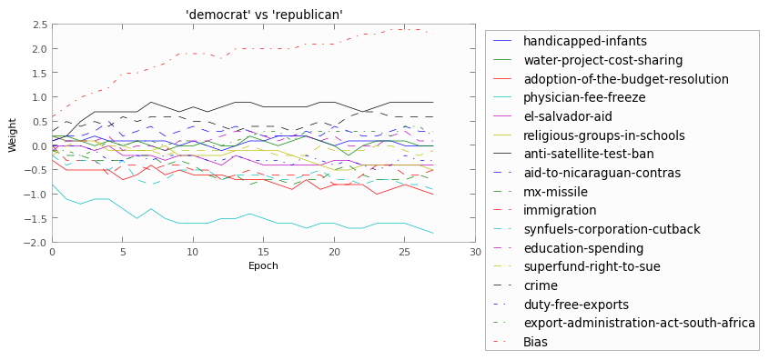
Here, if a line is above zero, it means (kindof) that “yes” was more associated with democrats, whereas if it’s below zero, “yes” is more associated with republicans. It’s of course more comlicated than that, but that’s the description that is easiest to envision.
I split the data 70-30, where 70% of the data was given to the perceptron to train on, and then 30% was used at the very end to “test” the classifier.
I ran it 5 times with different random splits (always 70-30), and the perceptron averaged 93% accuracy! Which I think is really cool.
Also, from looking at the weights we can get a feeling for where republicans and democrats differ most strongly. For example, congress members who voted “yes” on the “physicial-fee-freeze” bill where very likely republican, whereas those who voted “yes” on the “anti-satellite-test-ban” (whatever that was) where more likely democrat.
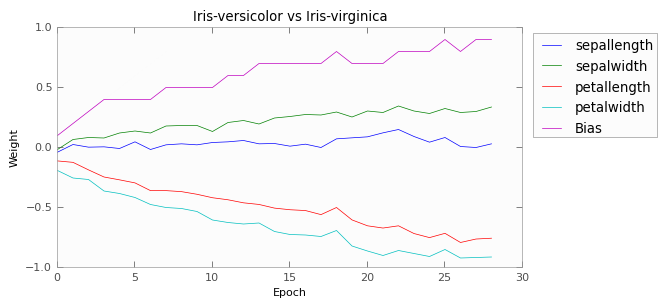
Iris Dataset
This dataset involves just 4 measurements on different specimens of three different species of iris. In order to classify this with a perceptron, I actually used 3, and each perceptron only had to distinguish between two of the species. Then at the end, the three perceptrons would “vote” on what they thought it was, and the class with the most votes won.
Here we have graphed the weights of each of the perceptrons.
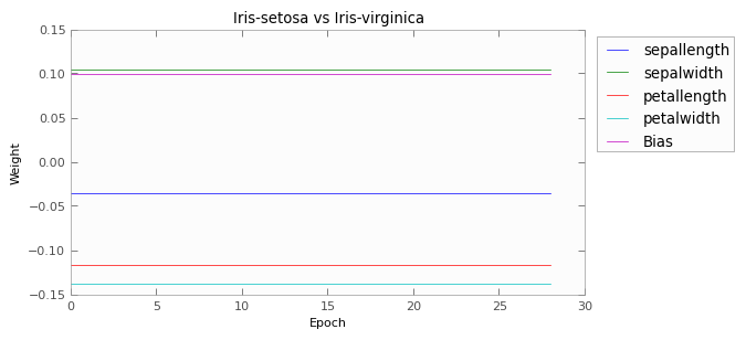
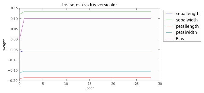
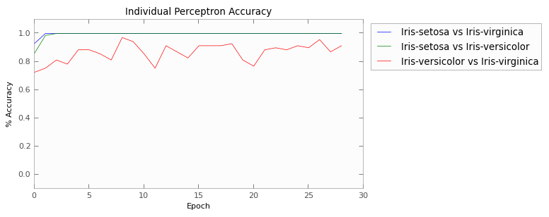
As you can see, the first two pairs of flowers are easily distinguishable using those four measurements. After two epochs, both perceptrons are achieving 100% accuracy on the training set.
The last pair, versicolor vs verginica, causes trouble, though. Their characteristics apparently overlap just enough to cause confusion, such that the perceptron is not able to find a hyperplane to separate the two. This is manifest in the results as well; the afterage test-set accuracy from 5 independant runs was 89%.